Watcher: App Intents
June 24, 2024 5:26pm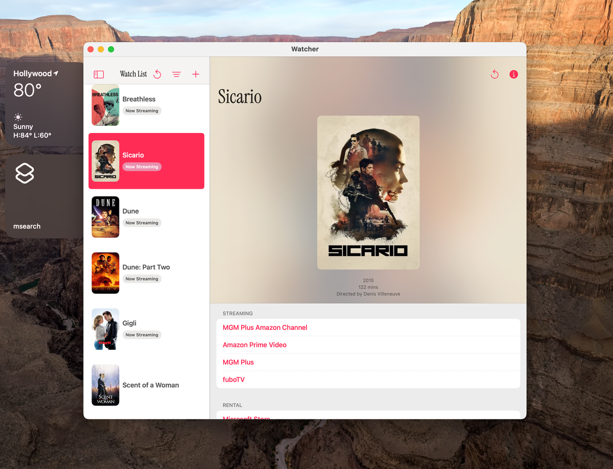
I've been working on an app called Watcher, which checks whether and where a given movie is streaming. I don't plan on releasing it any time soon, as it currently relies on a data source that I've, uh, scraped together, so to speak. (If anybody knows of a non-paid or cheap API, let me know. The ones I've found so far have all been those unsettling "don't worry about the price yet, tell us about yourself first"-types that never return my emails.)
Anyways, I like over-solving a simple problem, so it's been fun refining the app and trying out new things with it in my spare time. It being WWDC season, I've been watching a lot of session videos lately and using Watcher to try out some of the new frameworks and concepts. If you've been watching along too, you might have noticed App Intents looming large this year as the underpinning for some of the features announced under the "Apple Intelligence" banner.
App Intents give you the ability to extend your app to various parts of the system, including Spotlight, the Lock Screen, Control Center, and Siri. It's a way of encapsulating a piece of functionality and providing it for use à la carte outside the context of your app running in the foreground.
This year, Apple has gone so far as to change their "guidance" on App Intents, which sounds vaguely Vader-y.
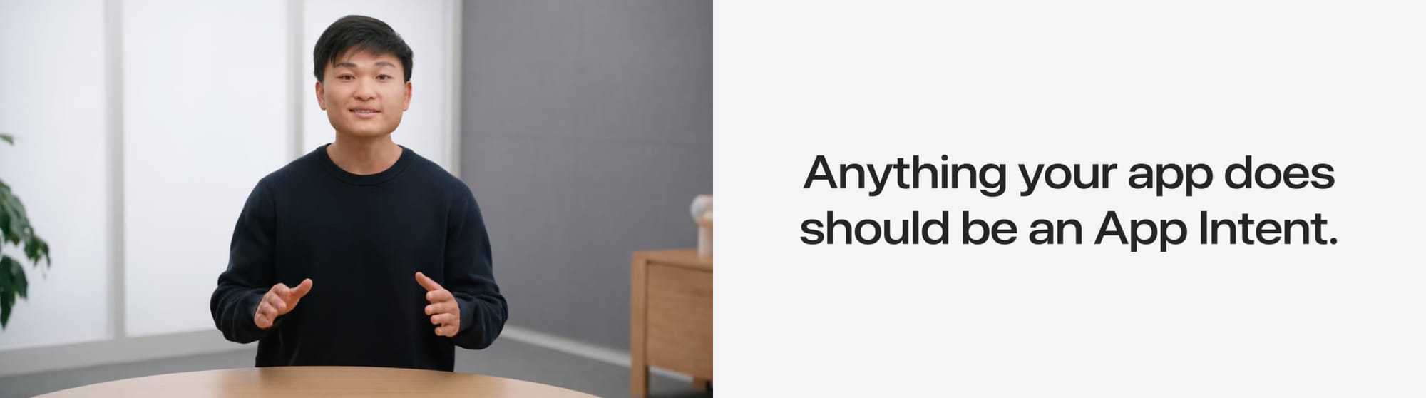
Whereas before, the idea was to simply make intents for a handful of only the most crucial features of your app, now they are literally telling you that "anything your app does should be an App Intent."
I've worked with the App Intents framework before for Carpark, but with the above in mind, I thought it might be a good time to start getting in the habit of setting up more intents. Here's how I implemented my first intent for Watcher.
import AppIntents
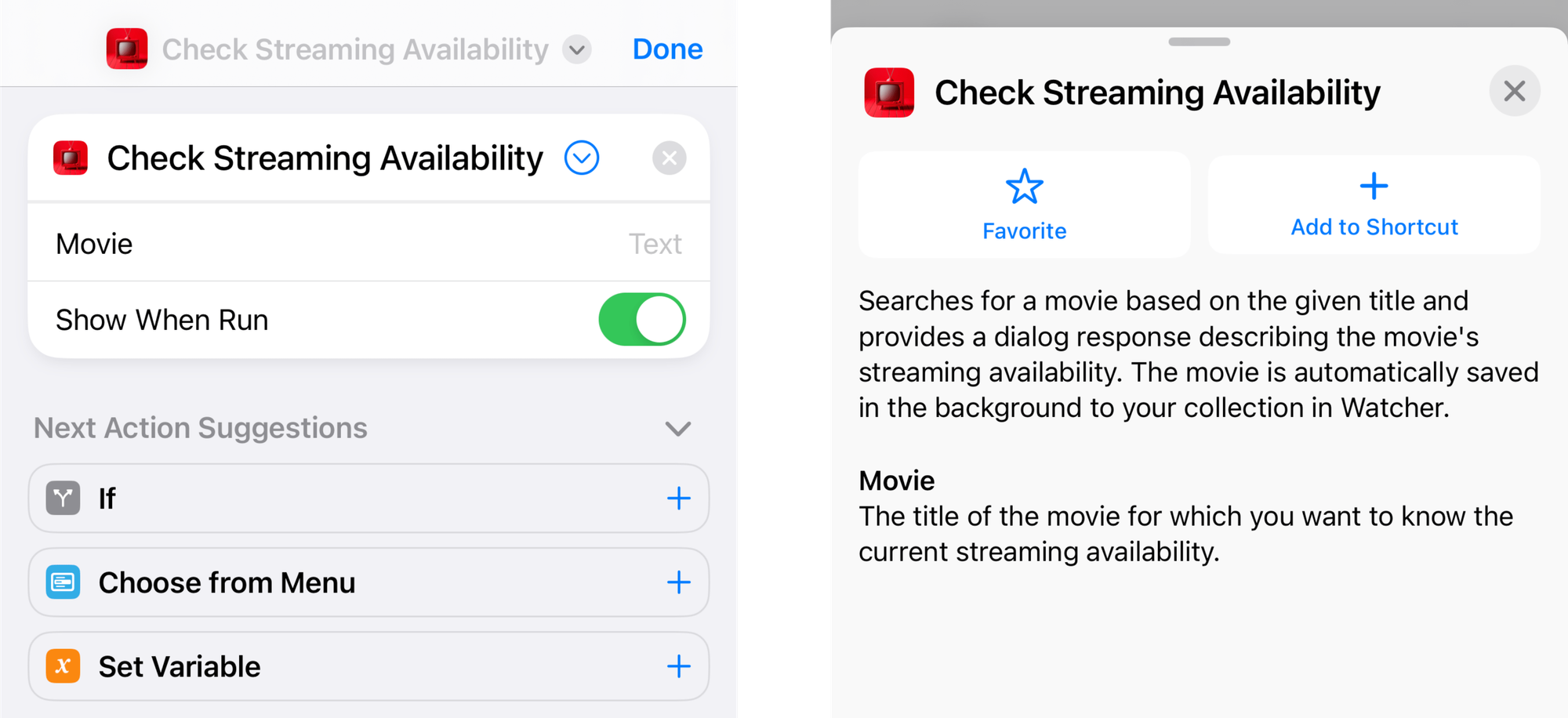
struct CheckStreamingAvailability: AppIntent {
static let title: LocalizedStringResource = "Check Streaming Availability"
static let description: IntentDescription? = "Searches for a movie based on the given title and provides a dialog response describing the movie's streaming availability. The movie is automatically saved in the background to your collection in Watcher."
@Parameter(title: "Movie", description: "The title of the movie for which you want to know the current streaming availability.")
var movieTitle: String
@MainActor
func perform() async throws -> some ProvidesDialog {
let container = DataCenter.shared.container
let streamingInfoController = StreamingInfoController()
let results = try await streamingInfoController.searchResults(forTerm: movieTitle)
if let firstResult = results.first {
let movie = try await streamingInfoController.itemFromSearchResult(firstResult)
container.mainContext.insert(movie)
switch movie.streamingServices.count {
case let x where x < 1:
return .result(dialog: "No, the \(movie.year ?? "") movie \(movie.title) is not currently available for streaming.")
case 1...5:
return .result(dialog: "Yes, the \(movie.year ?? "") movie \(movie.title) is currently streaming on the following \(movie.streamingServices.count == 1 ? "service" : "services"): \(movie.streamingServices.keys.joined(separator: ", "))")
case let x where x > 5:
return .result(dialog: "Yes, the \(movie.year ?? "") movie \(movie.title) is currently available for streaming on \(movie.streamingServices.count) services.")
default:
return .result(dialog: "No idea, man. Sorry. Some things we just aren't meant to know.")
}
} else {
return .result(dialog: "I'm sorry, I was unable to find a movie by the title \(movieTitle).")
}
}
}
My intent implementation.
One thing that might not be obvious to App Intents newcomers is that this is the entirety of it, by which I mean there is nothing else you need to do aside from defining an AppIntent-conforming struct as shown above. You don't need to initialize an instance of it anywhere. Once the app is installed, the system will see that this struct exists in your code and it will be automatically made available in the Shortcuts app and elsewhere.
The title property is required, though the description is optional. The default implementation for each is as a var, though here I've changed them to let constants in order to make them work with strict concurrency as enforced by the new Swift 6 language mode.
While you can leave the description out, I think it's best to put it to use and err on the side of over explaining. Anecdotally, I've found most users I know to have a loose enough grasp on how Shortcuts works that a little hand-holding is appropriate.
Speaking of descriptions, even if you've made App Intents before you may have missed the fact that parameters can have them too. A lot of tutorials and documentation I've found skip them, preferring the title-only initializer, and in iOS 18 you can even skip specifying the title entirely, in which case it'll synthesize one for you based off your variable name. However, like the description for the intent itself, I like providing them for parameters as it's a quick, easy thing to do which can have outsized benefits in terms of user experience.
An important point about the movie parameter here is that I very purposefully did not make it optional. You can have optional intent parameters and they are often (if not even usually) the right way to go. If the user provides no value for the optional parameter, the intent will assume a nil value and continue to call the perform method. If a parameter is non-optional, though, the system will proactively stop and ask the user to provide a value if it's missing, which is exactly what I want here, as this action is pretty useless without a movie to search for.
func perform() async throws -> some IntentResultThe `perform` method signature.
The perform method is the second and final requirement for an App Intent. The method returns a value conforming to the IntentResult protocol, and the default implementation expects you to return an empty intent result by simply calling .result(). This is great if no user feedback is required after the action is performed.
If you want to give back something that the user can use, such as an object or value which they can pass along to another Shortcuts action, or just some information about the action that was just performed, you can use one of these other types which conform to IntentResult: ReturnsValue, ProvidesDialog, or ShowsSnippetView.
For example, returning an Int could look like this:
func perform() async throws -> some ReturnsValue<Int> {
        .result(value: Int.random(in: 1...10))
}
In my case I wanted to take a parameter in the form of a string representing a movie title, use that to perform a search, find the movie, save it to my app's database and then get back to the user with a text description of the movie's streaming availability (or lack thereof.) From the user's perspective, they should be able to just ask Siri about a movie and get a spoken response, with everything else happening invisibly in the background.
ProvidesDialog is perfect for this. It allows you to return a string value which will either be read to the user or display as text on screen depending on the context from which it's invoked. Once I've gotten the needed info here and saved the movie, I use a simple switch statement to create a few different types of response string based on the results.
At this point, the intent is available as a Shortcuts action. The user can use it in their custom workflows, add it to the home screen, etc. This is great, but it still takes some setup from the user. There is one more step we can take to make this even simpler. We can create an App Shortcut, which acts as a kind of ambassador to the system, spreading the good news of our App Intent.
import AppIntents

struct WatcherAppShortcutsProvider: AppShortcutsProvider {
    @AppShortcutsBuilder
    static var appShortcuts: [AppShortcut] {
        AppShortcut(
            intent: CheckStreamingAvailability(),
            phrases: [
                "Check streaming availability",
                "Check streaming on \(.applicationName)",
                "Check \(.applicationName)"
            ],
            shortTitle: "Check Movie Streaming",
            systemImageName: "tv"
        )
    }
}
The AppShortcutsProvider constructs a collection of all our App Shortcuts. (In this case only the one, of course.) Each is initialized with a title, an SF symbol name, an instance of intent itself, and a list a phrases which when spoken to Siri will cause it to run your intent, allowing you to make multiple guesses at what your users might naturally say to when trying get at this functionality.

Alright, that's one feature turned into an App Intent! Now for...every other one.