Under Cover
Posted by on May 14, 2024 11:20am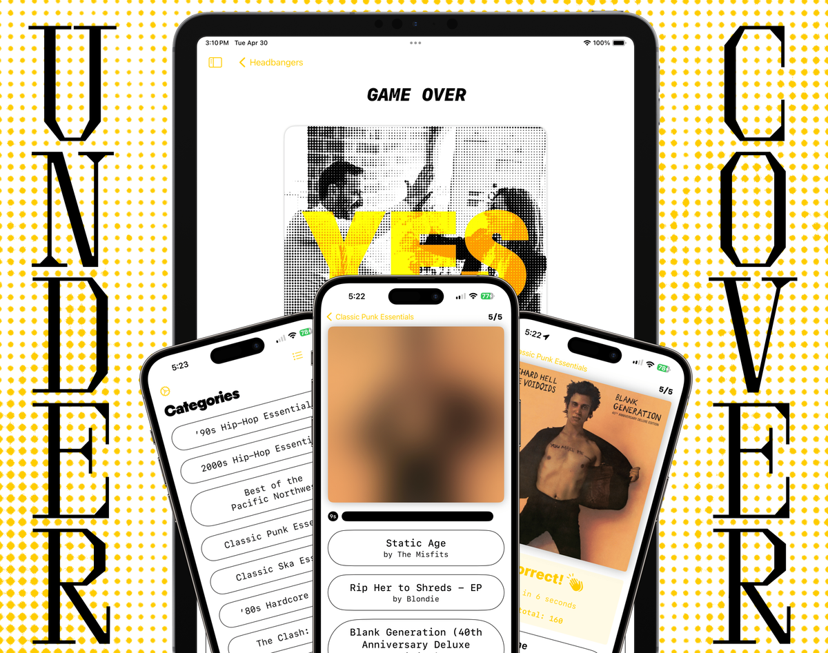
Under Cover is an album cover guessing game for music nerds. Something to kill time while waiting for your friend to join you in line at a show. Or, something to pick up every now and then just to remind yourself of your incredible, unparalleled music knowledge.
It’s currently available for iPhone and iPad on the App Store and the code is up on GitHub.
These are some notes on my experience making the app and some of the decisions that went into it.
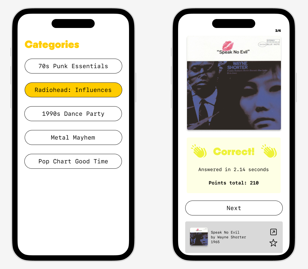
The gameplay is very simple: Each round, the user watches an obscured album cover slowly reveal itself and tries to guess it as quickly as possible. The quicker the correct guess, the better the score. Users can customize the number of rounds (as well as some other parameters if they delve into the settings screen.) That's about it.
I served all roles in the making of the app myself, from concept to design to coding to writing the App Store copy. I wanted to make a small-scale, fun, and modern SwiftUI app with a strong foundation upon which to build. I also wanted to challenge myself on how quickly I could execute. All told, I spent just over 90 hours on it, from creating a new Xcode project to publishing version 1.0 on the App Store. (Though, of course, there is much more work to be done to improve and expand it over time.)
Dev Notes
The app makes use of the MusicKit framework, which handles everything from Apple Music audio playback to fetching album metadata. SwiftData and the Observation framework are used for the model and controllers, respectively. It is 100% SwiftUI with a layout that adapts for both iPhone and iPad.
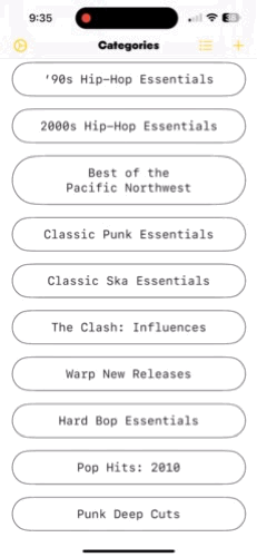
Before each game the user selects a category, i.e. a pool of albums from which random selections are presented to the user. The album model stores minimal data about an album: album title, artist name, a URL for the album artwork, and the album's ID on Apple Music, as well as a simple boolean to track whether it's been favorited by the user.
I chose to go with an album artwork URL rather than storing the image itself in the model for two reasons. Firstly, storage. Even optimized, those kilobytes can add up quickly! Second, even though album artwork is provided freely with few-to-no qualifications through Apple's own MusicKit API, from past experience I knew that actually storing artwork in-app could risk displeasing app review due to their, um, passionate stance on the copyrighted material of large businesses such as record labels.
This tied in to another concern, which was that of where the above-mentioned categories would come from in the first place. Having the user add albums manually to construct their own categories would ruin some of the surprise. Adding my own preset categories was something I wanted to avoid, at least for the time being, out of an abundance of caution due to those concerns about copyrighted material. It would be best to have an outside data source for albums which could present them grouped in some way that the user could browse and add from at will.
Playlists! Apple Music features public-facing playlists created by themselves, users, and outside curators. While the user has to be a subscriber in order to listen to a playlist, they do not in order to just read its metadata. And once we can do that, we can make separate requests to the MusicKit catalog for all the tracks' individual albums with their covers and other metadata — everything we need for the model.
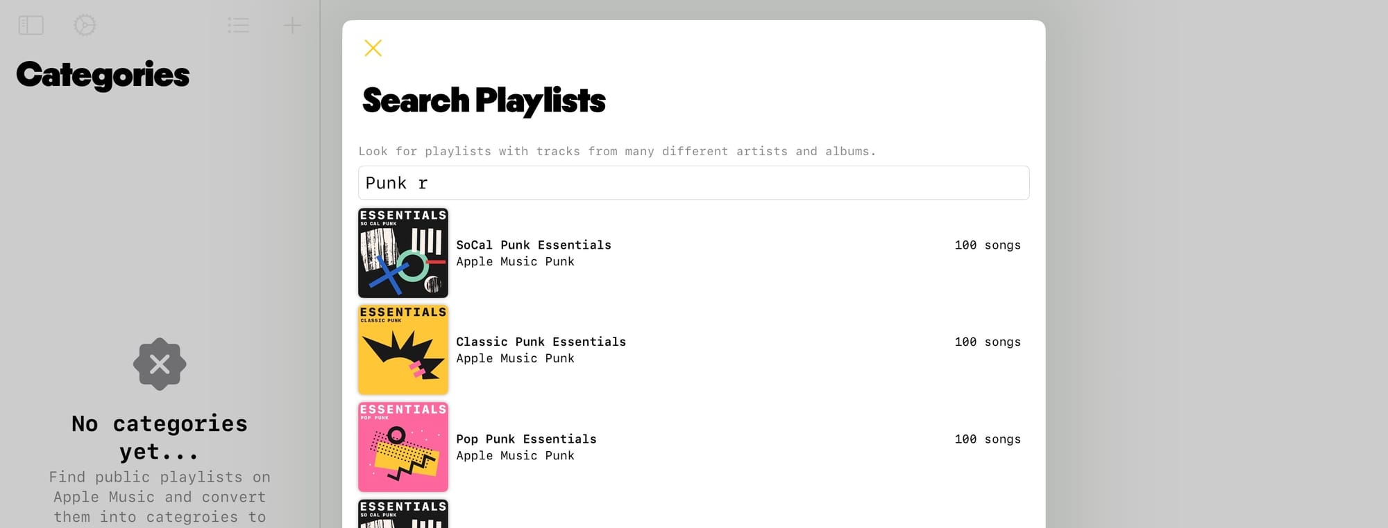
To facilitate this I implemented playlist search with live results presented and updated as the user enters their query. This involved managing multiple asynchronous music catalog resource requests so as to provide a responsive UI with meaningful feedback for the user while avoiding slowing things down.
After watching Alex Nagy's video on MVC in SwiftUI I was eager to try out a similar pattern here. The app uses two controller classes, both made using the @Observable macro and initialized and inserted into the app environment at launch: a single player game controller to manage gameplay and an Apple Music controller to monitor and react to things like subscription status and user authorization.
After the user has selected a category, set the number of rounds, and initiated gameplay, a GameState enum is initialized and changes to its value determine the user interface.
In addition to letting the user set the number of rounds before each game, the settings screen features further game customization options, such as a black & white mode for increased challenge. All of these settings are stored in User Defaults, with @AppStorage leveraged for use within views. Lately, in most of my projects, I’ve taken to creating a simple StorageKeys enum to keep things tidy when going between @AppStorage and accessing UserDefaults directly (the former being a wrapper for the latter.)
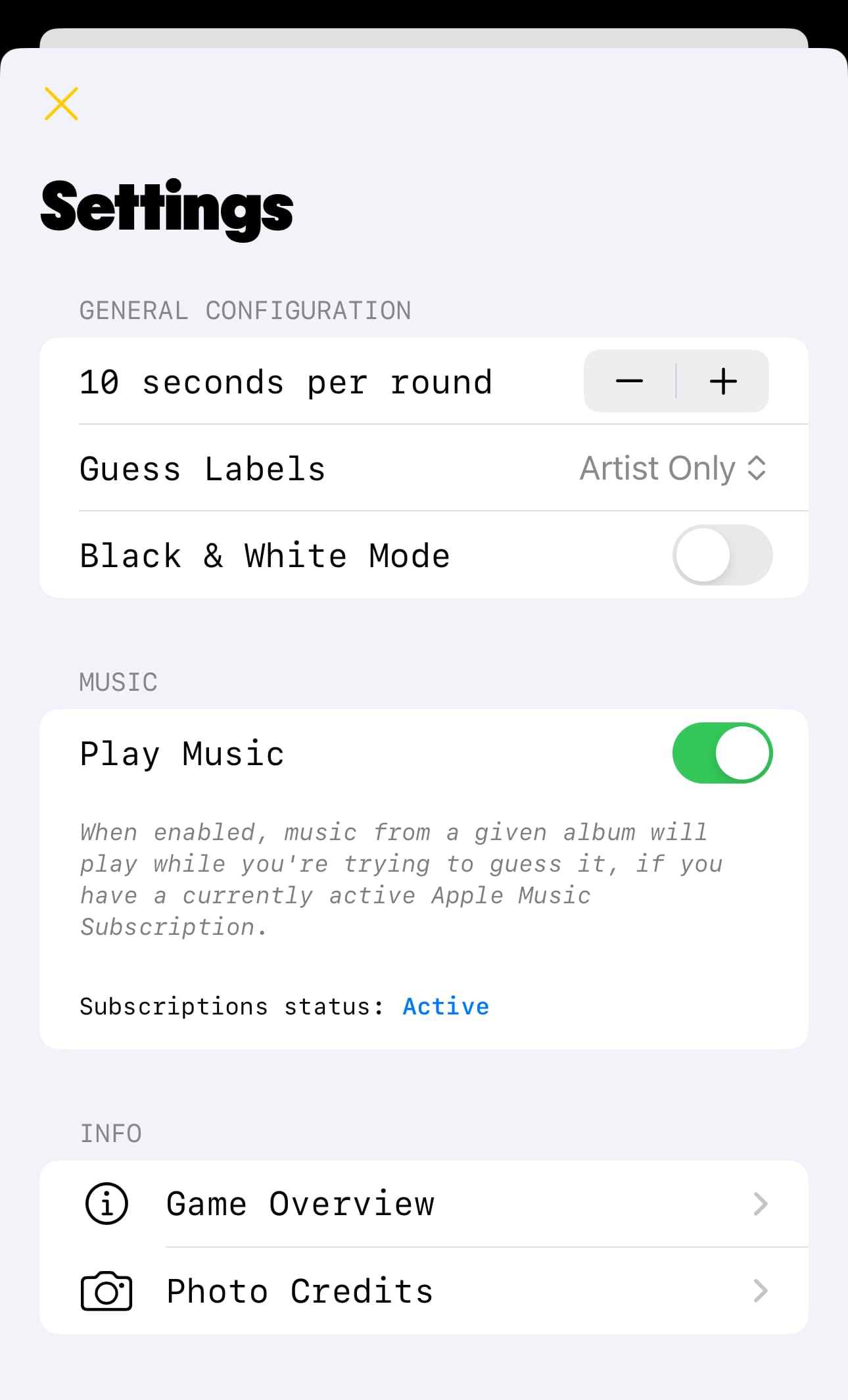
As noted above, all of the MusicKit features covered up to this point are available whether or not the user actually pays for Apple Music. MusicKit's functionality as a catalog data source only relies on the developer registering the app for the MusicKit service entitlement, setting the proper Info.plist values, and prompting for permission. However, if the user does have an active subscription, Under Cover takes advantage of that to offer the ability to hear the albums as they're guessing them. To accomplish this, the single player game controller uses the system music player singleton and manages its queue as the game progresses, playing a random song from each album during the guessing stage.
Design Notes
In line with the decision to move quickly, I did not do extensive wireframing or mockups. Instead, I decided to take some time to think through the app's needs, come up with a direction and some starting components, and then proceed to "design in code."
I've found Freeform to be a great tool for this kind of conceptual work (and for organizing thought during development overall.) Having a bucket to collect and draw connections between everything from links to graphic inspiration to API documentation pull quotes to sketches and diagrams and to-do lists works very well for the way I think and helps me keep the big picture in mind throughout.
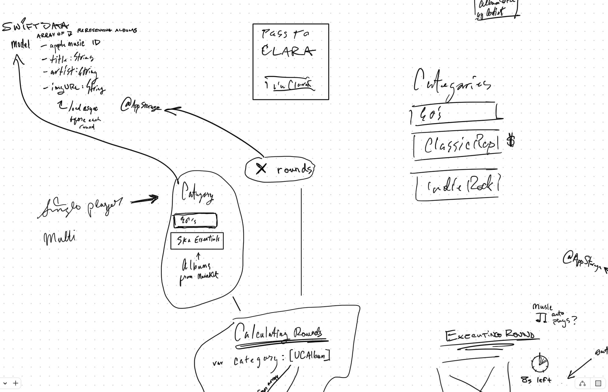
I designed the data model in parallel with diagramming the user flow, iteratively determining what data really needed to be stored based on what I want the user to see and do.
When it came to settling on an overall visual direction I had a few primary points I was considering:
- Fun. Games are supposed to feel fun, right? I knew I wouldn't have time to implement the kinds of shiny, maximalist design techniques I usually see used to convey fun. Maybe I could go more for something irreverent or even, dare I dream, funny.
- Staying out of the way. Since the key interaction in the app is studying an album cover as it slowly de-blurs, I wanted to create a neutral environment that wouldn't fight for attention.
- “Cool,” or something. It was important for me that it looks cool because I like things that look cool! I don't know why we as designers have decided it would be literal death to ever admit this, but aesthetics "for their own sake" do actually provide value in that humans appreciate aesthetics and it's nice when things are nice. Also, it's a music game. People who like music are cool (or at least want to feel that way.)
- Quick! Remember, I wanted something I could execute on fast.
So, I needed to do a lot with a little. I wanted something irreverent and immediate, minimal and to the point. What better a jumping off point then than one of the great music genres of all time, punk rock?
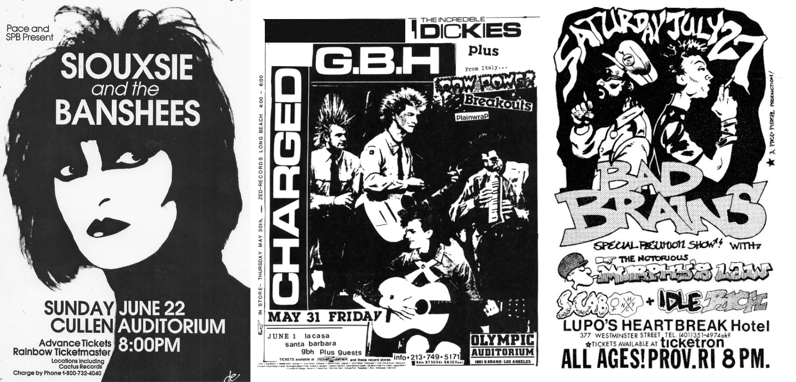
The classic punk rock show poster has a defined aesthetic based on limitations. Black & white, high contrast. Cheaply printed with images rendered in low quality. Lots of literal "whitespace." And they were fun! Even the bad ones were charming in their own way.
This served as a good point of focus. While the end product is in no way meant to literally evoke a show poster, the concept provided some useful constraints and the ingredients for a consistent visual language.
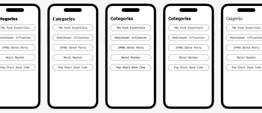
For type, after some trial and error, I landed on the pairing of SF Mono for body and PP Nikkei Maru Ultrabold for display. A monospaced font is a perfect fit for the punk poster aesthetic, and Nikkei Maru's Ultrabold's forcefulness is just enough of "too much."
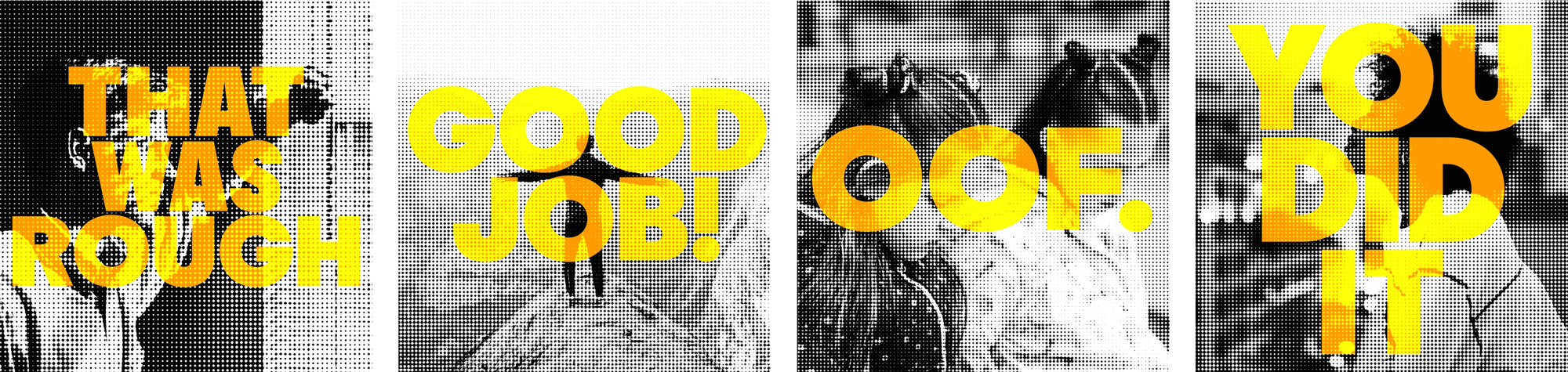
As a further tie-in to the poster idea, I applied halftone printing effect to a collection of photos which show when the user completes a game.
I drafted a couple sections of the app in Figma to give myself a jumping off point. The screen designs here were mostly unaltered in the shipping product and were extrapolated on for the other sections of the app. The simple pill button style became a key component, as did the short-throw drop shadows to highlight album covers and other featured elements.